300×250 / MREC / MPU / Medium Rectangle Ad
The 300×250 Banner Ad Unit is considered the workhouse of all the IAB Ad Units, and is widely requested by most advertisers as the strongest performing ad unit, thus creating high demand popular ad unit across Gourmet Ads. The 300×250 is available across all devices Desktop, Tablet and Mobile and is often known as being called the MREC, Mid Page Unit, MPU, Medium Rectangle Ad or Island Ad unit. Nearly every site across Gourmet Ads are enabled to run a 300×250.
Some Native Advertising Examples highlight an example of how 300×250 can be used in ads. By following these Native Ad Specs, you can ensure that your Native Ad is effective and successful.
Features & Benefits of the 300×250 ;
- Strongest Performing Ad Unit in terms of Viewability & Click Through Rate
- Programmatic Friendly: This ad size is one of the most commonly traded through programmatic platforms, making it easy to buy and sell automatically.
- HTML5 compatibility: The 300×250 ad can include interactive elements or animations. Built using HTML5 to ensure it is compatible with a wide range of devices and browsers, making it ideal for all types of rich media.
- Widely used by Publishers and Site Owners across all devices. Nearly every website, web page or app features this popular ad unit.
- Mobile-friendly design: Can be optimized for display on mobile devices ie Mobile Web and App. When browsing on a Mobile Device or App, is often the only Ad placements on the screen
- The Ultimate Cross-Platform Ad size
- Multi Sized Ad Slot can be run as an Expandable Ad Unit, Standard Ad Units or Native Ads
- Fast loading time: The 300×250 ad typically loads quickly, as it should have a small file size ~ 100kb max.
- File format: The ads should be saved in a file format that is compatible with the platform it is being displayed on. For example, Ad Creatives are often saved in GIF, JPEG, or PNG formats.
- Can be used Multiple times on the same web page: The Medium Rectangle can be used on the same page 2 to 3 times (in the Side Bar or in Content) compared to other ad sizes.
- The Med Rec is often used as a Companion Ad with Video Ad Campaigns
- Ideal for In-Unit Video Placement
- Approved IAB Ad Unit
The 300×250 Ad Creative & Video
It is possible to include video ads in a 300×250 ad creative. There are examples of several ways to do this, depending on the platform the ad is being displayed on and the specific content requirements and practices of the company or person behind the ad.
One option is to use an animated GIF image that includes a video clip. GIFs are image files that can include a still image or series of frames that play back as a looping animation. By creating a GIF image that includes a video clip, for example, you can create an image with the appearance of a video within the limited 300×250 ad creative space. Our specs require the still image and animation to cease after 30 seconds duration.
Another option is to use HTML5 to show text and have users create an interactive ad with a video player. HTML5 is a markup language that allows for creating interactive content with text and videos that can be displayed on a wide range of devices and browsers. By creating an HTML5 ad that includes text and links to a video player, for example, you can allow viewers to play a video within the text of the ad creative.
What does a 300×250 Ad Unit Look like ?
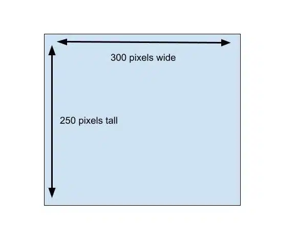
What Pixel Size is 300×250?
To put it simply the 300×250, is 300 pixels high by 250 pixels. A slightly larger option, the Large Rectangle at 336×280 pixels, offers increased width and text visibility within the ad, enhancing its effectiveness.
What is a 300×250 Ratio?
Medium Rectangle Ads have an Aspect ratio of 1.4:1 achieved for both smartphones and tablets.
Why Advertisers like the 300×250 Banner Ads
Advertisers consistently choose the MPU in size for their ad campaigns because it supports a wide range of creative formats—from static images to rich media. This banner ad size is favored due to its versatility and effectiveness across various digital platforms, including desktop and mobile. It is particularly suited for both messaging and integrating into the flow of webpage and app content, thereby catching the eye of potential consumers without disrupting the user experience.
Advertisers consistently choose the MPU for their ad campaigns because it supports a wide range of creative formats—from static images to rich media. This flexibility allows marketers to deploy impactful, engaging content that resonates with their target audience. The effectiveness of 300×250 banner ads in driving engagement and conversion rates underscores their prevalence and valuable part in advertising strategies. Their widespread use is a testament to their ability to balance prominence with subtlety, making them indispensable and valuable, in the arsenal of digital advertising tools.
Why the 300×250 Sees High Click-Through Rates
Advertisers consistently observe the 300×250 ad unit delivering exceptionally high click-through rates (CTRs). This format strikes an ideal balance point between size and full screen visibility, making it incredibly effective when placed above the fold on a website or app. Its ample full screen dimensions allow for an optimal display of text, visuals and interactive elements, ensuring that key advertising messages are not only seen but are also engaging and compelling to the audience.
From our experience, compared to other ad units and other screen sizes, the 300×250’s familiar format resonates well with internet users, fostering trust and encouraging interaction. Its effectiveness is further enhanced by its adaptability across different pages and content types, making it a preferred choice in all digital campaigns. This combination of strategic visibility position, user familiarity, and value and versatile application across various websites positions the 300×250 unit as a top performer in generating user engagement and driving higher click-through rates.
Cross-Platform Consistency
The 300×250 ad unit boasts exceptional cross-platform consistency, which is a significant advantage for the advertiser designing a single ad to be used across various environments. When creating a 300×250, it’s designed to function seamlessly whether it’s placed on a webpage or within an app, ensuring that the same ad can be utilized efficiently on desktops, tablets, and mobile devices. This uniformity in ad size, width, shape, text, and placement across different platforms ensures that regardless of where the ad appears—be it a mobile app or a desktop page—the user experience remains consistent, enhancing the overall effectiveness of the advertising campaign. This makes the 300×250 not only a versatile choice but also a cost-effective one, simplifying the design process and maximizing the ad’s reach and impact.
Don’t have a 300×250 Ad Creative?
Gourmet Ads can take your existing creative assets and develop 300×250 ad units for your campaign using your brand standards quickly and cost-effectively.
Otherwise if you are looking for ideas or resources to help design your 300×250 Banner Ads see ;
Need Creative Specifications?
Ad Examples of 300×250

Weber 300×250

Barilla 300×250
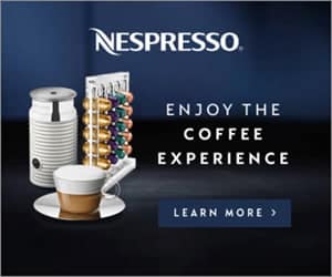
Nespresso 300×250
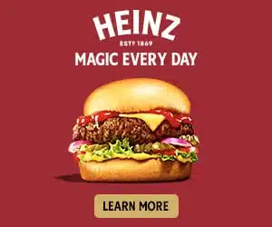
Heinz 300×250
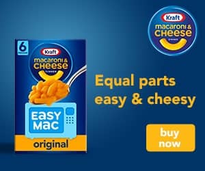
Kraft Mac & Cheese 300×250
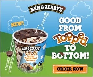
Ben & Jerry’s 300×250

FoodSaver 300×250

Starbucks 300×250

San Pellegrino Sparkling Water 300×250

Uber Eats 300×250

Let’s Get Started !
Let the Gourmet Ads team walk you through all the options available to ensure that your Food, Supermarket, Beverage or Kitchen advertising campaign has the best possible combination of Premium Guaranteed Inventory, Scale, First Party Data, Contextual Targeting and Programmatic Advertising elements.


