Call to Action Examples Every Advertiser Needs
A Display Advertising Campaign wont work if nobody engages or clicks on the Creative. Advertising can’t generate leads without a clear and direct Call to Action. Potential customers want to be told what to do in order to benefit from your product and service. If you’re ambiguous about what steps your customers need to follow, they’ll simply click away and find another service. Luckily, penning a call to action is pretty easy. Let’s unpack what a call to action really is, why it is so important, and what examples you can use to set yourself apart from the rest.
What Is a Call to Action (CTA)?
A Call to Action, also known as a CTA, is a clear and direct statement used within the advertising creative to direct visitors to the related content or form etc. A Call to Action is used as a sort of marketing strategy to give potential customers clear instruction on what they need to do next after visiting a website.
For example, a Specialty Food Website is advertising a product, say flavored salt. Within the Advertising Creative the Call to Action could be either Buy Now or Add to Cart.
Why is a CTA so Important?
Too many businesses don’t invest time in creating a relevant Call to Action. This may be because the business believes its potential customers can “figure it out” or that calls to action are pushy and sometimes annoying.
When it comes down to it, every business advertising pages should utilize Calls to Action and there might be multiple. When a business makes it easier for potential customers to get to the end goal, the potential customer has a lot less work to do. If your website is set up in a way that navigating to your products page or sign-up page takes a long time, your potential customers may simply end up clicking away.
User-friendliness is key when selling products or services online. Customers are persuaded to purchase and consume specific food products through food advertising trick. There are several top food blogs available, each with its own strategy and emphasis. These strategies include making the product look more desirable using eye-catching visuals, snappy slogans, and persuasive language. A Call to Action provides a more user-friendly experience for your potential customers.
Call to Action Examples
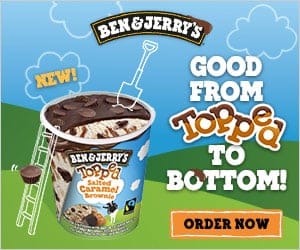
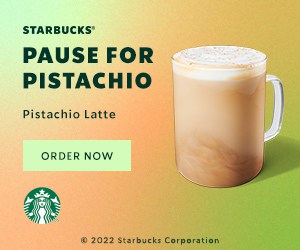
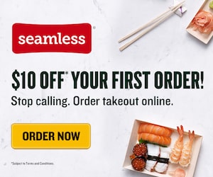
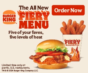
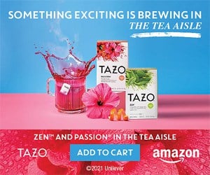
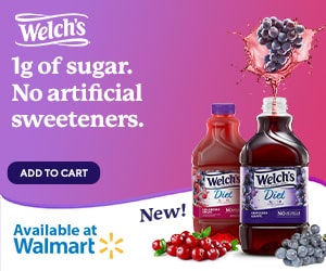
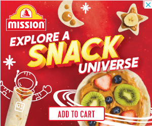
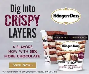
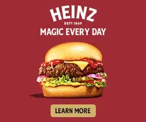
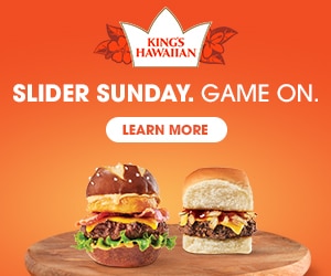
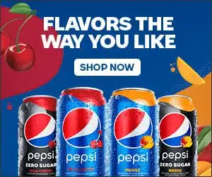
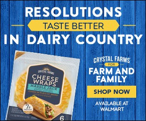
These tried and true Call to Action Examples can be customized by you to become something more unique. Remember that your call to action should be extremely simple and direct. We’ve included a few ad examples (mostly 300×250 and 970×250) that show the Call to Action.
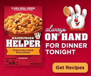
1. Get Recipes
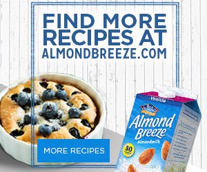
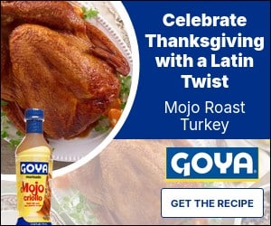
Obviously for food brands the Call to Action “Get Recipes” is highly relevant and popular across Gourmet Ads. With our Food Advertisement Examples, we have helped numerous businesses. We see this Call to Action used when brands are encouraging downloads of Recipes / Cookbooks which can be printed or pushing consumers to their website which features recipes. We also see this being used when targeting our Household Cooks Segment.
CTAs are an essential component of marketing and web design because they direct consumers to a desired conclusion and urge them to take action. However, it’s important to understand the role that what is A/B testing. You can optimize your strategy and generate CTAs that increase conversions by utilizing A/B testing to test multiple variations of your CTAs and analyze the results. For example, food blog advertising adds a CTA on their website that states “Get recipes” and connects to a page with a selection of their best recipes. By incorporating this CTA, the writer is asking their viewers to take the next step and explore more of their material. A CTA must be clear, explicit, and relevant to the user in order to be effective. It should also be displayed prominently, such as above the fold on a homepage or at the bottom of a blog article. Furthermore, the CTA should reflect the tone and style of the website or marketing materials in which it appears. You can develop captivating CTAs that motivate people to take action and engage with your company by following these best practises.
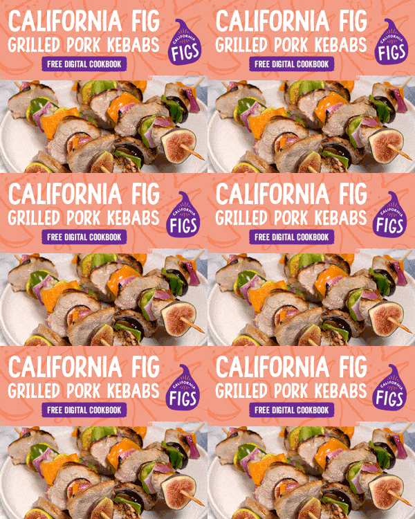
2. Free Cookbook / Download Cookbook
Closely related to the above Call to Action of “Get Recipes” is “Free Cookbook” or “Download Cookbook”. We see this Call to Action used when brands are offering a free PDF download of their Cookbook of recipes for a Food brand. People should utilise free cookbooks in their call to action buttons for a variety of reasons. For starters, free cookbooks are a great resource for anyone searching for new and unique recipes to try. They can go through a variety of foods to locate something that meets their tastes and nutritional needs. Second, free cookbooks are frequently produced by experienced chefs and food aficionados, so the recipes are likely to be trustworthy and tried and true. Users may be certain that the food will turn out nicely and that they will not spend time or money on a recipe that does not work. Finally, utilising a free cookbook might assist in saving money on costly ingredients or restaurant meals. Users may save money while still enjoying great and diverse meals by cooking at home and following the recipes supplied. Overall, including a free cookbook in a call to action button is a wise and cost-effective decision for anyone wishing to broaden their cooking talents and experiment with new dishes.
3. Buy Now
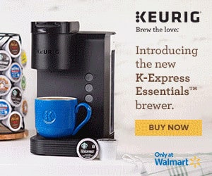
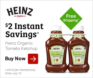
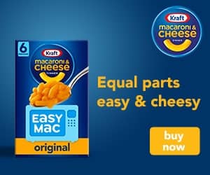
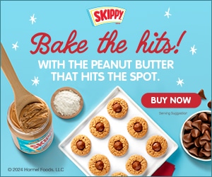
When it comes to a Call to Action, consumer package goods may distinguish itself from competitors as simplicity is key, and “Buy Now” couldn’t be any simpler. Try making it extremely clear exactly where potential customers need to go to make a purchase. There are various reasons why consumers should choose “Buy Now” as their call to action button. Firstly, it clearly conveys the required activity to the user. By clicking “Buy Now,” the consumer understands exactly what is required of them and can quickly take the appropriate action. Second, “Buy Now” is a powerful and convincing term that urges consumers to buy. It suggests that the product is in great demand and urges users to act swiftly to avoid missing out. Finally, “Buy Now” buttons outperform other words such as “Add to Cart” or “Learn More” in terms of turning users into buyers. In conclusion, utilising “Buy Now” as the call to action button is a successful technique to urge customers to make a purchase, as it clearly expresses the intended action and is persuasive in nature.
4. Order Now
Like “Buy Now”, “Order Now” is a Call to Action which makes it very clear where potential customers need to go in order to purchase your product or service, ideal for advertises which facility ordering online. Order Now is a compelling call to action that may dramatically enhance conversions on websites and online retailers. Here are some of the reasons why individuals should include Order Now buttons in their call to action buttons:
1. It expresses the desired action clearly. Order Now eliminates any doubt about what the user is expected to accomplish. It’s a bold, straightforward call to action that informs the user exactly what to do.
2. It urges immediate action. Order Now is a term that pushes consumers to act quickly and buy something. This is especially useful for limited-time deals or high-demand items.
3. Order Now is a very powerful call to action that may greatly enhance conversions, according to studies. It’s an easy and efficient method for encouraging consumers to proceed with their purchase.
In conclusion, the call to action “Order Now” is strong since it makes it obvious what should be done and promotes quick action. It has also been shown to increase conversions. It’s an easy and efficient method for encouraging consumers to proceed with their purchase.
4. Add to Cart
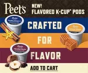
The Call to Action “Add to Cart” is very specific for advertisers which run eCommerce on their website. Data analytics for consumer package goods is the collection and analysis of data points generated by any sales marketing activity carried out by a field team. It is very clear that when you click on this advertisement, the product being advertised will be added to your shopping cart on thier website. We see lots of brand advertisers also using this where they are sending consumers to large shopping retailers like Amazon as opposed to their own site. Add to Cart is a common and successful call to action (CTA) for e-commerce websites since it allows visitors to purchase things quickly and simply without leaving the page. This CTA is very effective for those who are short on time or like to make quick and easy transactions.
Additionally, Add to Cart buttons allow consumers to simply add several goods to their cart, making it easier for them to finish their purchase in a single transaction. This not only saves the consumer time, but it also raises the likelihood of a successful conversion for the business. Customers may access and manage their carts from anywhere on the website by integrating Add to Cart buttons with various e-commerce platforms and shopping cart software. This offers another degree of ease and aids in the checkout process.
5. Save Now
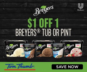
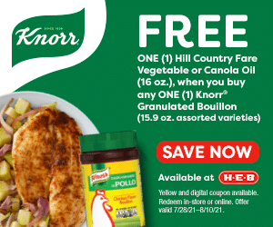
Another eCommerce-related Call to Action is “Save Now”. This suggests to the consumer that if they click on the advertisement they will make a saving by buying online. Sometimes the Call to Action is “Save Now with Promo Code”. People should include “Save Now” in their call to action buttons for a variety of reasons. First and foremost, it is a clear and straightforward message informing the user of what will occur when they click the button. It is neither unclear or misleading, and it expresses the importance of the action quickly. Furthermore, utilising the phrase “Save Now” in the call to action button conveys a feeling of urgency and pushes the user to act fast. This is especially useful for time-limited deals or promotions. Finally, “Save Now” is a motivating and encouraging message that urges the user to take charge of their finances and make wise choices. Businesses may appeal to consumers’ desire to save money and make wise financial decisions by including this phrase in their call to action buttons.
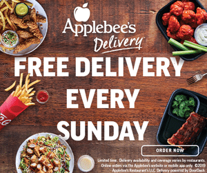
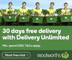
6. Free Delivery
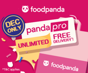
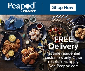
Online retailers and food delivery apps are quite competitive, so offering free delivery for new clients can set your service apart from the rest. There are various reasons why individuals should utilise the phrase “Free Delivery” in their call to action (CTA) button. For example, free delivery might be a great motivator for potential clients. If a buyer is thinking about buying anything online, knowing that they can get it delivered for free might be the determining factor. Free delivery might help a firm stand out from its competition. In a saturated online economy, giving free delivery may help a company stand out and attract more clients. Offering free delivery can aid in the development of client trust. By giving free delivery, a company demonstrates that it is prepared to go above and beyond for its consumers and is dedicated to providing a great purchasing experience. Overall, utilising the term “Free Delivery” in a CTA button may be a powerful method to enhance conversions, attract new customers, and develop confidence with prospective purchasers.
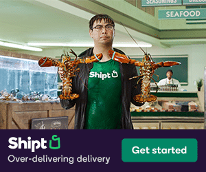
7. Get Started
Offering a way to get started with a product or service can be the ideal call to action for many companies. Get Started is an efficient and strong call to action button that may assist organisations and individuals in increasing conversions and driving more visitors to their websites or landing pages. Get Started is a basic and uncomplicated phrase that evokes a sense of activity and urgency. It tells the user precisely what they need to do to get started, making the following step easier for them to take.Get Started” is a universal phrase that people of all languages and cultures understand. This makes it an excellent alternative for companies with a worldwide audience. Get Started is simple to remember, increasing the likelihood that consumers will remember to act when they see it. Get Started is a strong and effective call to action button that may assist organisations and individuals in increasing conversions and driving more visitors to their websites or landing pages. So, if you want to increase traffic and conversions, include Get Started in your call to action button.
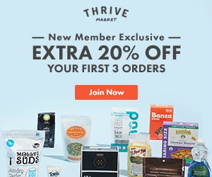
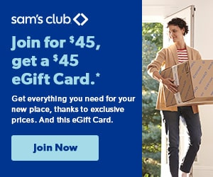
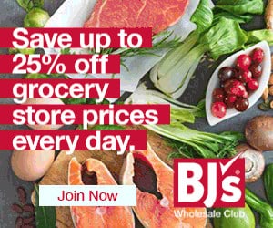
8. Join Now
If your business solicits memberships, subscriptions, and collaborations, using language that encourages the lead to take part in the experience works well as a call to action. By employing the term “now,” Join Now urges immediate action. This indicates to the user that they must act immediately rather to wait or study their alternatives. Utilizing the term “join” conveys that the user will be part of a community or organisation if they take action. For many people, a sense of belonging and connection may be a tremendous incentive. Utilising the term “Join Now” on a call to action button communicates what the user has to do in a straightforward and succinct manner. It removes any question or confusion regarding the next steps, making it easy for the user to take action. In conclusion, employing Join Now in a call to action button is an excellent method to drive instant action, establish a sense of belonging, and clearly express the user’s next actions.
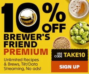
9. Sign Up
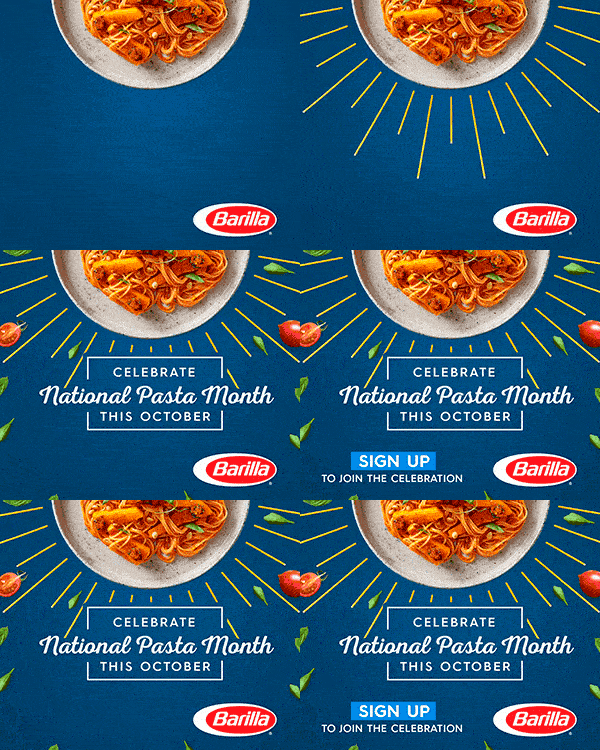
This Call to Action is ideal for websites that offer services, informative newsletters, or online courses. The usage of “Sign Up” conveys the intended action to the user, making it easier for them to comprehend and follow through. Second, it is goal-oriented. By employing the word “Sign Up,” you are urging the user to take quick action and become a member of your community or service. This is very useful for growing a client base or generating leads. By utilising “Sign Up,” you are making a direct appeal to the user to join your community or service, which can be more successful than employing a more passive call to action such as “Learn More.” Overall, including “Sign Up” in your call to action button may be a powerful method to increase user engagement and establish a loyal client base.
10. Subscribe / Subscribe Now
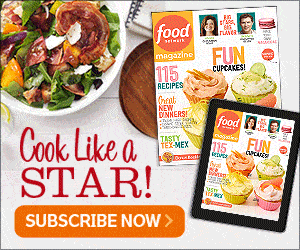
A Call to Action such as “Subscribe Now” is often used by companies that offer subscription-based services or content, such as magazines, streaming channels, or monthly box packs.
These types of products or services are typically delivered regularly, such as monthly or quarterly, and the “Subscribe Now” Call to Action serves as a way to encourage the viewer to become a subscriber or customer.
Apart from the products mentioned above, the “Subscribe Now” Call to Action can be compelling for a wide range of products or services, not just those delivered regularly. For example, a company that sells a physical product might use a “Subscribe Now” Call to Action to encourage the viewer to sign up for recurring product delivery.
Overall, the “Subscribe Now” Call to Action is a powerful tool for encouraging viewer engagement and conversion and can be effective for various products or services.
11. Free Download
This is a step up from “download now.” Offering any sort of free product, even if it is something small and downloadable, gives your potential customers a chance to experience your brand for free. Free items inherently attract people, especially when they believe the worth of what is being supplied to be great. By delivering a free download, you are giving the consumer something of value without expecting anything in return. The action that will be carried out when the button is pressed is made very plain by the words “Free Download.” This can assist in eliminating any doubt or hesitancy that a user may have regarding what will occur when they click the button. Establishing trust with the user can be facilitated with a call to action button that reads “Free Download.” You may demonstrate your willingness to provide value to the consumer without asking anything in return by delivering something for free.
12. Learn More
If you offer a product or service that requires a bit more of an explanation, a “learn more” call to action gives a distinct direction for curious leads to take. Users are urged to continue exploring via the “Learn More” button, which fosters curiosity. Users are prompted to learn more about the good or service by the implication that there is more information accessible. It clearly explains to the user what they must do and what to anticipate after clicking the button. Conversion rates may go up as a result of this clarification. Choosing to “Learn More” is optional. Users are given the option to continue exploring without making a purchase or signing up. Users who are not yet ready to make a choice might benefit most from this since it gives them the opportunity to learn more before committing. Any website or marketing effort would benefit from include “Learn More.”
13. Click to Call
Interactive websites, such as websites with chat functions, can use this call to action to get leads to interact with your customer service team to schedule an appointment or learn more about your brand. With the immensely helpful Click to call function, users may quickly contact companies or people by clicking a button on their website or app. This prevents individuals from having to physically type in and dial a phone number, which is particularly helpful for those who access the internet on their mobile devices. Without having to manually input a phone number or keep it in mind, consumers may connect with companies quickly and easily by using click to call. Users may click a button and speak to a representative in a matter of seconds rather of waiting for a webpage to load or going to a contact form. As more and more people use their smartphones to access the internet, the click to call function is essential for companies trying to connect with these mobile consumers. Businesses may make it simpler for users to connect with them and go to the next stage in their customer journey by including a click to call button in their call to action.
14. Chat Now
This is similar to “click to call” and can be used to get your leads to get more information from your customer service team. With the help of the effective call to action butto “Chat Now”, companies can communicate with their clients in real time and respond to their questions and problems in a kind and timely manner. Businesses may improve client happiness, foster trust, and ultimately boost conversions by including Chat Now in their call to action button.
The capacity to manage several chats at once, which helps the company save time and resources, is one of Chat Now’s primary advantages. Additionally, it makes it possible for client concerns to be resolved more effectively since the chat operator can easily find pertinent information and offer practical answers. Compared to email or phone contact, Chat Now enables a more natural conversation flow, allowing for a more customised engagement with clients. As a result, clients may become more devoted and have a better overall experience. In general, Chat Now is a useful CTA button for companies trying to enhance customer service and build long-lasting connections with their audience. Businesses may promote more consumer interactions and increase conversions by incorporating it into their call to action button.
15. Shop Now
The Call to Action “Shop Now” is one of the most popular used by our food and supermarket advertisers. It’s straight to the point and lets consumers know they can buy your product straight away online and without delay. We reviewed the majority of Amazon Food Ads run across Gourmet Ads and nearly all of them used “Shop Now” especially for Amazon Fresh.
Many online retailers have landing pages that describe their brand, and the actual shopping aspect is separate. A pop-up call to action with a link to the actual shop reduces the amount of time your potential customers will need to find your actual products. It may be quite useful to include the word “Shop Now” in a call to action button for a variety of reasons. The consumer is first and foremost given a clear understanding of the planned course of action. This sentence makes it plain that the user should make a purchase, eliminating any doubt as to what the button is for. The call to action “Shop Now” is also a powerful one that exhorts the user to act right away. It suggests that the buyer won’t want to miss the chance to buy the goods and instils a sense of urgency. Last but not least, including “Shop Now” in the call to action button can aid in boosting conversions and boosting sales for the company.
16. Try for Free
Advertisers that offer free trials, free samples, or memberships, that can be a good Call to Action to consider. Both the customer and the company stand to gain by using the “Try for Free” call to action button. It gives the customer the chance to try out the good or service before making a purchase. Before they spend any money, they will be able to use this to determine if it satisfies their wants and expectations. As it demonstrates that the company is confident in their product and prepared to let the customer try it out for free, it also helps to establish trust and credibility with the customer. For the company, it gives them a chance to promote their goods and perhaps turn free trial consumers into paying clients. Positive client testimonials and word-of-mouth advertising can also be generated.
17. Start Your Free Trial
Subscription-based businesses, such as delivery, streaming video and music services, should consider a call to action that offers a free trial for potential customers. Start Your Free Trial provides prospective clients a risk-free option to test out a good or service. Businesses may boost the possibility of turning prospective clients into paying customers by giving a free trial so they can sample what they have to offer. It gives companies a chance to highlight the benefits of their item or service. Businesses may showcase the advantages and features of their product or service by providing a free trial, which may assist persuade potential clients to make a purchase. It may be a significant instrument for developing credibility and trust with potential clients. A strong call to action button like “Start Your Free Trial” may help businesses and individuals boost website traffic and conversion rates. Businesses may use this button to increase their chances of success by giving customers a low-risk way to test out a product or service, showing off the value of what they have to offer, and building trust and confidence in their brand.
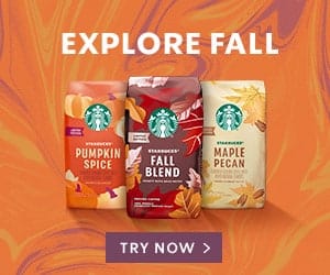
18. Try Now
Ideal for why you’d like to tempt consumers Try a new product range, start a free trial, obtain a sample, or start a membership, that can be a good call to action to consider. The Try Now CTA clearly states what the user must do. It fosters quick action and clears up any ambiguity or doubt on the next move. Second, the phrase “Try Now” exudes a sense of urgency and impels the user to seize the chance. It implies that the deal or item is worthwhile and deserving of consideration. Furthermore, it suggests that the converting procedure will be simple and hassle-free, enhancing the likelihood of conversion. Last but not least, adding “Try Now” to the call to action button is a quick and easy technique to boost conversion rates and generate more leads or purchases. Overall, the call to action button “Try Now” is a great option for urging people to act right away and test out the supplied good or service.
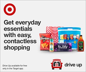
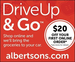
18. Drive Up
We started seeing “Drive Up” during Covid for Supermarkets and Grocery Stores offering “Contactless” or “Click and Collect”. Ideal for any advertiser. Businesses may entice clients to use this practical service by using Drive Up in their call to action button. Drive Up is useful for the client and profitable for the company. It could result in greater sales, a decrease in the amount of time spent in-store, and an increase in turnover. Businesses may also reach a bigger audience and foster greater consumer loyalty by using Drive Up. Overall, companies and customers benefit equally from employing Drive Up in the call to action button. It provides a hassle-free buying experience and could boost client happiness and revenue.
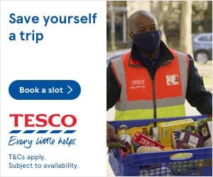
19. Book a Slot
This Call to Action is specific for Online Grocery Delivery or Drive Up / Click and Collect type services which require a time to be booked. We’ve seen this Call to Action increase during Covid. Customers may plan their appointments or bookings using the Book a Slot call to action button. As a result, they won’t have to worry about making a reservation while on hold or in line. They only need to click the “Book a Slot” option and select the time that is most convenient for them. It aids organisations in more effective appointment and scheduling management. They can more easily plan and arrange their workload since they can clearly see which slots are open and which ones are already taken. Customer satisfaction may be raised by using “Book a Slot.” Customers will value the flexibility of scheduling their own appointments, and businesses will profit from happier clients.
20. Download Now
If you have content or an application that is downloadable, offering a distinct and clear link to where leads can try out your product can turn them into potential customers. The user can clearly see what they will be doing when they click the Download Now call to action. It clears up any ambiguity or doubt about what will occur next, which is crucial for boosting conversion rates. The phrase “Download Now” implies that the user will receive something right now, which can be a powerful inducement to act. Using the words “Download Now” in front of an offer might assist create a sense of urgency since they suggest that the consumer has to act fast to take advantage of the deal. In general, “Download Now” is a strong call to action that may boost conversions and motivate visitors to take action on a landing page or website.


